Python: encontrar patrón en una trama
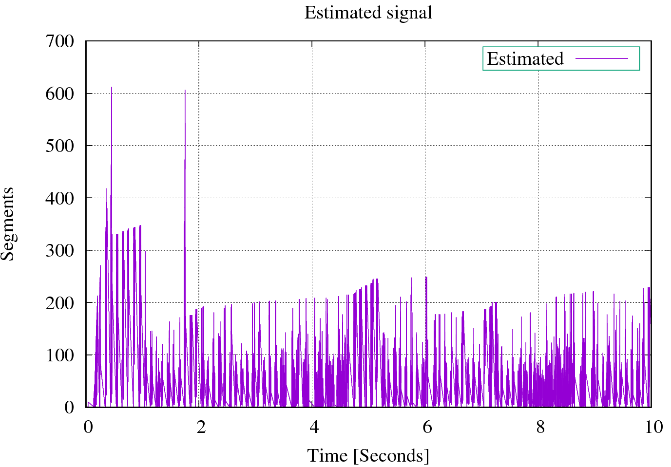
Este gráfico es generado por lo siguientegnuplot guión. losestimated.csv El archivo se encuentra en este enlace:https://drive.google.com/open?id=0B2Iv8dfU4fTUaGRWMm9jWnBUbzg
# ###### GNU Plot
   set style data lines
   set terminal postscript eps enhanced color "Times" 20

   set output "cubic33_cwd_estimated.eps"

   set title "Estimated signal"

    set style line 99 linetype 1 linecolor rgb "#999999" lw 2
    #set border 1 back ls 11
    set key right top
    set key box linestyle 50
    set key width -2
    set xrange [0:10]
    set key spacing 1.2
    #set nokey

    set grid xtics ytics mytics
    #set size 2
    #set size ratio 0.4

    #show timestamp
    set xlabel "Time [Seconds]"
    set ylabel "Segments"

    set style line 1 lc rgb "#ff0000" lt 1 pi 0 pt 4 lw 4 ps 0

    # Congestion control send window

    plot  "estimated.csv" using ($1):2 with lines title "Estimated";
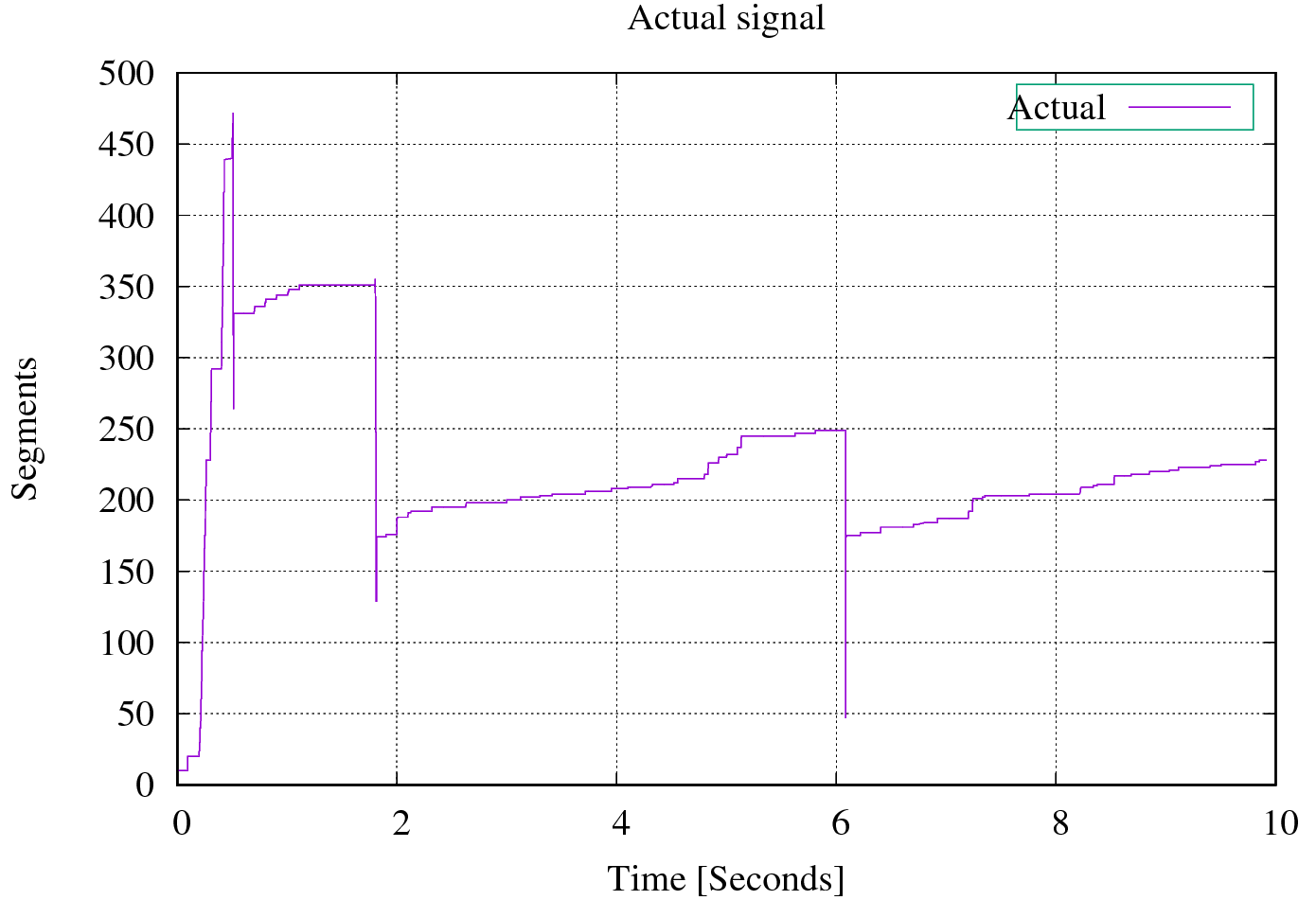
Quería encontrar el patrón de la señal estimada de la trama anterior algo cercano a la siguiente trama. Mi verdad fundamental (la señal real se muestra en la siguiente trama)
Aquí está mi enfoque inicial
#!/usr/bin/env python
import sys

import numpy as np
from shapely.geometry import LineString
#-------------------------------------------------------------------------------
def load_data(fname):
    return LineString(np.genfromtxt(fname, delimiter = ','))
#-------------------------------------------------------------------------------
lines = list(map(load_data, sys.argv[1:]))

for g in lines[0].intersection(lines[1]):
    if g.geom_type != 'Point':
        continue
    print('%f,%f' % (g.x, g.y))
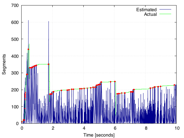
Luego invoque este script de Python en mignuplot directamente como en lo siguiente:
set terminal pngcairo
set output 'fig.png'

set datafile separator comma
set yr [0:700]
set xr [0:10]

set xtics 0,2,10
set ytics 0,100,700

set grid

set xlabel "Time [seconds]"
set ylabel "Segments"

plot \
    'estimated.csv' w l lc rgb 'dark-blue' t 'Estimated', \
    'actual.csv' w l lc rgb 'green' t 'Actual', \
    '<python filter.py estimated.csv actual.csv' w p lc rgb 'red' ps 0.5 pt 7 t ''
lo que nos da la siguiente trama. Pero esto no parece darme el patrón correcto, ya que gnuplot no es la mejor herramienta para tales tareas.
¿Hay alguna forma de encontrar el patrón del primer gráfico?estimated.csv) formando los picos en una parcela usando python? Si vemos desde el final, el patrón en realidad parece ser visible. Cualquier ayuda sería apreciada.