¿Puedo recrear este gráfico de araña de coordenadas polares en plotly?
Tengo un poco de dificultad para descubrir cómo recrear el siguiente gráfico de un gráfico de araña (o radar), usando plotly. En realidad, ni siquiera puedo recrearlo en las versiones más recientes de ggplot2 porque ha habido cambios importantes desde 1.0.1.
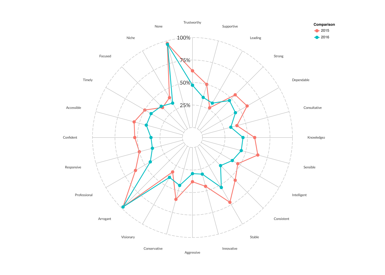
Aquí hay un gráfico de ejemplo:
Aquí está la función original que lo creó:
http://pcwww.liv.ac.uk/~william/Geodemographic%20Classifiability/func%20CreateRadialPlot.r
Aquí hay un ejemplo de cómo funciona la función original:
http://rstudio-pubs-static.s3.amazonaws.com/5795_e6e6411731bb4f1b9cc7eb49499c2082.html
Aquí hay algunos datos no tan ficticios:
d <- structure(list(Year = rep(c("2015","2016"),each=24),
                    Response = structure(rep(1L:24L,2),
                                         .Label = c("Trustworthy", "Supportive", "Leading",
                                                    "Strong", "Dependable", "Consultative",
                                                    "Knowledgeable", "Sensible",
                                                    "Intelligent", "Consistent", "Stable",
                                                    "Innovative", "Aggressive",
                                                    "Conservative", "Visionary",
                                                    "Arrogant", "Professional",
                                                    "Responsive", "Confident", "Accessible",
                                                    "Timely", "Focused", "Niche", "None"),
                                         class = "factor"),
                    Proportion = c(0.54, 0.48, 0.33, 0.35, 0.47, 0.3, 0.43, 0.29, 0.36,
                                   0.38, 0.45, 0.32, 0.27, 0.22, 0.26,0.95, 0.57, 0.42,
                                   0.38, 0.5, 0.31, 0.31, 0.12, 0.88, 0.55, 0.55, 0.31,
                                   0.4, 0.5, 0.34, 0.53, 0.3, 0.41, 0.41, 0.46, 0.34,
                                   0.22, 0.17, 0.28, 0.94, 0.62, 0.46, 0.41, 0.53, 0.34,
                                   0.36, 0.1, 0.84), n = rep(c(240L,258L),each=24)),
               .Names = c("Year", "Response", "Proportion", "n"),
               row.names = c(NA, -48L), class = c("tbl_df", "tbl", "data.frame"))
Aquí está mi intento (no muy bueno)
plot_ly(d, r = Proportion, t = Response, x = Response,
        color = factor(Year), mode = "markers") %>%
layout(margin = list(l=50,r=0,b=0,t=0,pad = 4), showlegend = TRUE)
¿Alguna idea sobre cómo podría recrear esto usando plotly?